Connect with us
Recent Posts
-
SEO Web Design
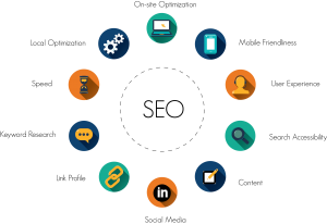
A badly put together, unutilized site can ruin your business. The way your website design is set up can affect your SEO and thus your rankings. Your home page needs to be uncluttered, with plenty of white space goes over well. A crowded block of too small text smack in the middle of your home page is just sloppy and unattractive. You need clean lines and plenty of space with your main headers and buttons clearly defined so your visitor can see what you offer.
Your header should be wide and clean, with your name and slogan well displayed. Try not to clutter your header with unnecessary info that is only going to be repeated elsewhere on the page. The right and left sides of your home page are a great place for extra info. A search box, a category box and your guarantee of secure purchasing are good to have above the fold, as well as a register now spot. Save your privacy notice, contact info and other such links for the footer.
Use the center section of your home page to tell just a little about what you offer, and why your visitor should take a moment to explore. If you have a special, here is a good place to plug it. Don’t make your home page too big! It will load slowly, and having to scroll down is boring. In fact, all of your site should be quick to load, as well as being easily navigable without all visitors having to resort to a sitemap. However, you should still include a sitemap, and your map should be very clear. Use words that will tell exactly what the consumer can expect on the page linked to (This is a good place for keywords!!!)
If you have articles, link them naturally rather than with a link that simply says ‘articles’, and make sure they are on well formatted pages that are easy to read. Use a picture to break up the text, and always double space your paragraphs for ease of reading. Avoid hard returns! Your other pages on the site should always contain a link back to the home page, and (if appropriate) a call to action such as register now, add to cart, or buy now! Keyword optimize your pages, but not to the extent that you lose your user friendly aspect, and don’t make every third word a link- that is very distracting.
If you have advertising on your site, or affiliates, be careful that you do not detract from your site’s effectiveness and visibility. Unless you are running a site solely for AdSense income, you need to be promoting your own products! Overall, your site should now have a balanced look. The cool monthly specials and sales item should be front and center, with a brief welcome and overview of the site’s mission.
On the left should be the category box, followed by a special promo for gift certificates and shipping options. Below that is plenty of room for a link or two to the articles on the origin of the company, and maybe a customer review. On the right, the secure payment advisory should be displayed, with the search box under that, then the sign up box for the e-mail, newsletter, etc. The whole page is a single screen now, with text about products relegated to individual inner pages to break up the graphics and add interest. Accompanying graphics should be captioned, tagged and should render quickly! This is so important – they add a personable touch to the site!
A website built according to these methods will have several benefits over a cookie cutter template or sales page site: traffic will be better due to SEO, and the traffic will stay once they arrive since the site is actually appealing and navigable. Knowing how to draw a consumer in in the first 5-10 seconds and then keep them working their way through the funnel until they make a purchase.
Recent Posts
-
What are Top 2020 SEO Trends...
1.The ERA Of VOICE SEARCH Hello, 2020! Long gone are the days when we used to head over to the search engines on our desktops and
Read More -
Why Is SEO Super-Duper...
The year’s 2019! We have long laid our footsteps in this digital world. Did you know that more than 4 billion people al
Read More -
National SEO Services –...
Introduction about National SEO Services A National SEO service provider uses search engine optimization practice to enhance the
Read More


